When thinking about signal processing in neuroscience we turn immediately to the action potential. Processing neural recording data in this form (single spikes or local field potentials) has been the subject of computational pipelines in many coding languages for decades. However, kinematics, gene expression, vocalizations, and decision-making, are also signals. Almost anything that changes in level over distance or time and is sampled at a high rate can be analyzed using signal processing tools. In fact, we can apply tools from spike-sorting pipelines (such as clustering algorithms) to “spike-sort” gene expression or limb kinematics.
This article will present signal processing tools (and some other open-source tools) for neuroscience data analysis in python, and give examples of their applications to various types of data. We will start with some of the more interesting and lesser-known applications. I hope that after reading this article you will have a solid basis of where to find specific tools related to Python in Neuroscience. These tools are presented in the form of Juypyter Notebooks and hyperlinks are scattered throughout the article.
In the video above I made a tutorial on how to spike sort using open-source tools that are coded in python. The data used for spike sorting was recorded from 4 Cambridge Neurotech probes which each had 16 channels for a total of 64 channels. The recordings are from two areas of the mouse hippocampus (CA1 and CA3).
Basics of signal processing in Python: scipy.signal
Scipy is great all around, and I would be remiss if I did not start with scipy.signal, the workhouse python signal processing package for Python. While it’s outside the scope of this article to run a demonstration of each and every scipy.signal function, we will cover some of the most important ones, and I encourage you to check out the documentation. For this first section, I’m going to walk you through a few basics using a paper I’ve recently published on limb tracking data in short-tailed opossums. We used DeepLabCut to gather the limb tracking data, which is a great resource for any scientist that conducts animal behavior. Feel free to follow along using the Jupyter Notebook in my GitHub, “Single_Trial_Code_Notebook.ipynb.”
In this first cell of this notebook I’m reading in my tracking data using pandas, adding some conditional columns for later use, and normalizing my tracking data to the size and speed of the video. Side Note: Learning how to master Python’s Pandas package will make your life in signal processing a lot easier. This is because changing DataFrames from wide-to-long or long-to-wide format, or selecting signals based on stimulus, gene, bodypart, etc, is often needed to accomplish your task. We’ll cover some of that in the rest of this notebook.
In the second cell of this notebook you’ll see I’ve plotted forelimb displacement over time as the animal crosses the ladder apparatus. If you want to see some videos of the animals doing this task to get a grasp of where this signal comes from check out the videos in this paper. At any rate, we next smooth out some tracking errors in our signal using the gaussian_filter1d function from scipy and run one of the most clutch features of scipy.signal, which is find_peaks. Signal processing is about finding signal, right? This function has various parameters which allow you to find only peaks above a threshold or at a certain distance from one another. Feel free to play around with the parameters and see how it changes the plot in the notebook.
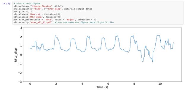
In the next few cells, we take the peak locations, remove the ones we don’t want, and get rid of everything else, leaving just the peaks of our forelimb displacement and the 50 frames that exist on either side of them. This is what I call ‘chunking’ as you’re selecting specific pieces of your entire signal based on distance or time. If you have gene expression this may be in reads, or if you have histological data maybe this is in millimeters, or if you have spike data, this is also time.
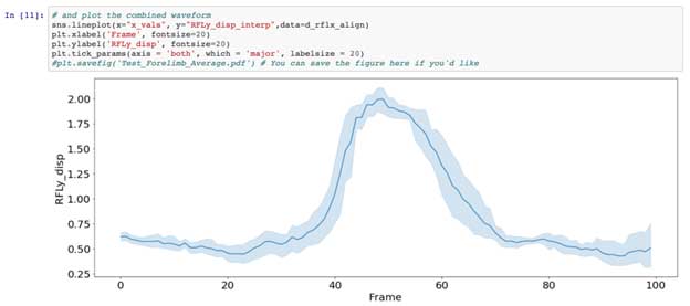
Chunking out data requires that you have at least some idea of the length of the signal you want to analyze, and most importantly, that what you are interested in is combining or comparing single events vs the entire signal at large. At any rate, the rest of the notebook lines up our chunked-out events by peak and ends with an average event signal for that trial.
Signal processing across the length of a signal: Spectral analysis, Fourier Transforms, and Autocorrelations
After analyzing single events, we may next wish to analyze the signal at large. In our case, we are analyzing forelimb motions, which are highly stereotypical and occur at regular intervals due to the musculoskeletal system. Thus, we expect there may be some underlying pattern or frequency with which they occur, and perhaps this differs between experimental conditions.
Enter spectral analysis, which measures the strength of periodic components of a signal at different frequencies. Tools in spectral analysis allow for us to understand periodicity in our data. Pyspectrum is a home for many of these tools. However, much of these tools also exist in scipy and scipy.signal. To stick with our theme of analyzing kinematic data, we’ll look do some basic spectral analysis on our opossum tracking data. Much of this code comes from Qing Kai’s blog. Follow along using the Opossum_periodicity.ipynb from my GitHub.
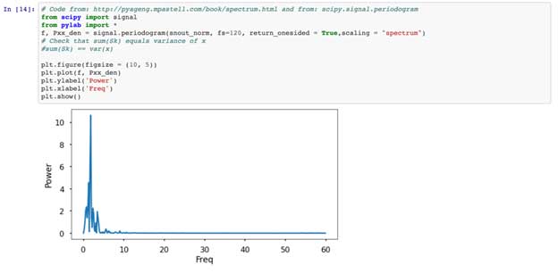
One of the simplest things to do is look at zero crossings, which give a rough estimate of periodicity. Zero crossings are exactly what they sound like, the number of times and location along a signal where the zero-point is crossed. For oscillatory data, the zero point should be the mean of the signal. We accomplish this mean-normalization in cell 3 of the notebook.
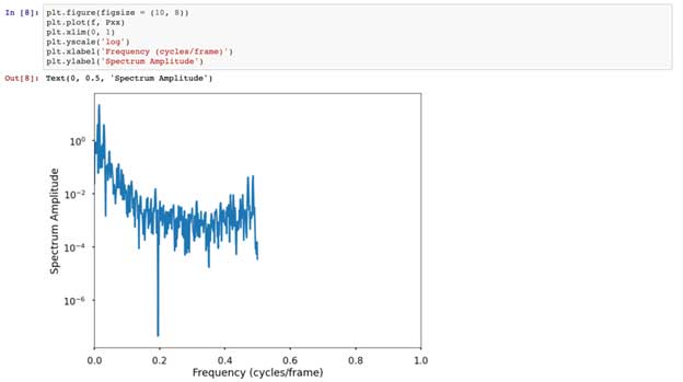
Using Qing Kai’s blog with some help from Stackoverflow, we create a zero-crossings detector that estimates the period of our forelimb signal, in our case, about 23 frames. Further following Qing Kai’s instruction, we use scipy.signal to plot the periodogram and rank the peaks, where the higher the peak, the stronger the signal is repeating. Our data shows that the 74 peak is the highest, which means that for every 74 frames the signal repeats. This is interesting, as each step is between 60-80 frames long.
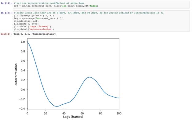
Continuing down the notebook and blog post, we run an autocorrelation on our forelimb data. Autocorrelations show the degree of similarity between a given time series, and a lagged version of itself, measuring the relationship between current and past values. Put simply, autocorrelations tell us how past values impact future values. If there is a high autocorrelation, then past values are good indicators of future values. You’ll notice that at 0 frame lags, there is high autocorrelation coefficient ( = 1), because with no lag, the signal is obviously correlated with itself. More interesting however, is that we again see a peak around a 74 frame lag (values 74 frames apart are correlated).
Lastly, we’ll implement a Discrete Fourier Transform (DFT), which gives us a frequency domain representation of our signal. For this, we’ll run some code from this book chapter, which I suggest reading as it goes into detail about these methods. To paraphrase, in the time domain we are looking at when/where and how much a signal changes. However, in the frequency domain we are looking at how often something occurs. These types of spectral analysis are more often used to analyze audio signals, but I encourage the unorthodox application of analysis techniques because I believe progress is made with innovative thinking and a diverse perspective (we’ll show an example of this later as we apply fMRI analysis techniques to gene expression data). However, you also don’t want to just throw signal processing tools at signal without knowing the question you are interested in. Importantly, and I can’t emphasize this enough, you must understand the assumptions of your data and the test you are using.
To learn more about Spectral Analysis in Python I suggest checking out Dr. Mike X Cohen’s YouTube channel.
You can now apply the above techniques to other body parts present in the tracking data I’ve provided. However, analyzing limb kinematic data in the frequency domain does not yield much insight. Tracking data of the whiskers, however, which have known oscillations, might be more fruitful. You can also apply these techniques to Chimpanzee vocalization data, which can be found here.
Clustering and Correlations: Single and Multi-Dimensional Data
Experimental neuroscience is about detecting differences. We might want to know how an Alzheimer’s mouse model differs from the control, or how gene expression in one species might differ from another. In an era where data acquisition is high throughput, we often have thousands of datapoints and creating simple bar graphs and using t-tests can be inappropriate. Seems like a good time to throw machine learning at signal processing!
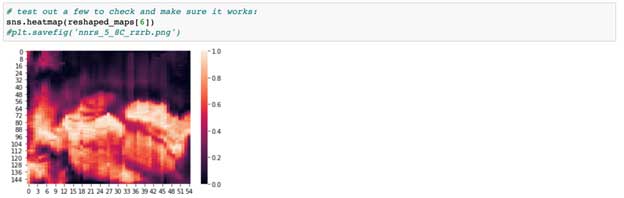
Jake VanderPlas has written several books about signal processing and data science in Python. We’re going to run through a few techniques, but he covers all of these and more in great detail (for example, this article on Principal Component Analysis). For this demonstration, we’re going to use the Spatial_Expression.ipynb notebook from my github. Here we are working with dense H5 files, where the spatial location of gene expression in the neocortex is given by X and Y coordinates and the level of gene expression is the Z coordinate, all of which have been standardized across cases. 8 of these brains are from voles, and the other 3 are from mice. The data was collected from in-situ hybridized slices and is presented as heatmaps. We’d like to know how cortex-wide patterns of gene expression are related. To do this we use PCA and K-Means clustering to look at how expression maps vary from another. We use these methods to reduce the dimensionality of our large arrays to capture the essence of where/what variation exists. If you’re interested in learning how PCA is run, you can check out this article, which steps-through how to conduct a PCA in Python without using many prebuilt functions.
Nonetheless, we first import a lot of packages (a bit messy), mostly from sci-kit learn (sklearn). We’ll use some of these, but I’ve left a lot of others in here because I want you to be aware of their existence and importance. The second cell just reads in the data and parses the H5 files to obtain the X,Y,Z coordinates we’ve described above. Next, we make sure our maps are all the same. For this we use resize from sci-kit image. You can also use numpy.resize, or you can use SciPy’s interpolation function (1 or 2 dimensional) if you want more control over how the data are squeezed and stretched. Importantly, you should be aware of the assumptions that each method takes to reshape data. As you’ll learn if you try to accomplish many clustering/comparison tasks, having data of different sizes and shapes will throw errors. We reshape here because we want all the data in the same reference frame before drawing comparisons. We then plot an example map in the next cell, showing us the spatial distribution of RZRb (a gene) in a neonatal vole cortex.
Next, we flatten (or vectorize) the data. This is a key step and major assumption. Many clustering/correlation/comparison methods require that data be flattened from an N-dimensional matrix (many dimensional array) to a vector (1-dimensional array). Once arrays are vectorized, you can correlate across the entire array (numpy.corrcoef) or implement clustering algorithms like cosine similarity, which involve calculating and comparing the angle between vectors. In my opinion, these are the simplest ways to demonstrate clustering techniques, but they are not the only or the best. If you are interested in multidimensional clustering techniques, first check out this PDF from a class at UC Davis. (Note: still confused on why we use dimensionality-reduction? Check out another one of Dr. Brownlee’s articles on dimensionality reduction in Python.
Continuing down our notebook, we stitch our DataFrames together, and use the pandas transform function to change our DataFrame from a long-to-wide format, where each row now represents the entire vector of spatial gene expression. We then implement and plot our PCA. We use the X and Y-axes to plot the second against the first principal component, and different colors to denote different species (black = vole, gray = mouse). You can change the my_pal variable so that color shows the 3rd principal component, or use a 3D plot from matplotlib (and even include an animation to rotate the 3D plot: it’s much simpler than you might think).
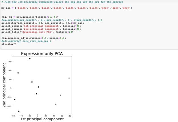
Next we start to build the K-Means application. This geeksforgeeks article, and the Jupyter notebook, will walk you through how to choose the number of clusters to use for your dataset. I present two methods for this, the first is the elbow-point method, and the second is the silhouette coefficient. Personally, I think the silhouette coefficient is more reliable. However, you can use both and hopefully they will converge on the same number of clusters for your dataset. This is one of the unsupervised portions of the implementation, as the algorithm is telling you how many clusters to choose before you tell the algorithm how to cluster the data. We choose the highest silhouette coefficient and/or the point of the elbow after the end of exponential decay. For our example, we choose two clusters. There are two species present in our dataset, and they appear to cluster in the PCA, so maybe this is telling us something! In the last bit of code, we choose two clusters. While we usually let the algorithm determine this number for us, we can also choose the number of clusters based on a hypothesis we might have. For instance, I want to check if the K-Means algorithm can properly label a map as ‘vole’ or ‘mouse.’ So, I force the K-Means algorithm to decide between these two, giving the algorithm a virtual forced-choice task. Note of caution: this should be used to inform your hypotheses and not prove them. That is because all algorithms have their flaws (a few discussed below). Nonetheless, we print the clustering labels in the last cell, and you’ll see that the algorithm scores 7/10 correct at labeling which species a heatmap belongs to. This is about 20% above chance, not great. What does this mean? One interpretation is that there is not enough difference in some maps to tell them apart, perhaps showing that both species have related patterns of gene expression. If the maps were markedly different, we might expect the algorithm to easily sort them into the correct species at 100% accuracy. This interpretation comes with caveats, mostly involved with how we reshape and flatten the data, and how the algorithm calculates centroids, the existence of outliers, and the initial partitions made.
You don’t have to apply this notebook to large arrays like I have. You can cluster more standard signals such as neuronal spikes, audio, or other time-series data just the same. To do this, input your own data, and skip the flatten step (because you already have 1D arrays). If you don’t have your own data, you can use pandas to create a sub-frame of just one of the sections of the larger arrays simply by selecting a single row or column of the 2D data. You can go back to the opossum behavior paper if you want to see what clustering 1D looks like. If you’re interested in analyzing gene expression data, the Allen Institute has a large database available.
I hope you’ve noticed that we have covered a lot of topics that seem to also be involved in image processing and stock market technical analysis. This is because images are signal in 2D, and stock prices are densely collected signal data as well. To this end, when comparing signal of vastly different scales or asking how past data may impact future data, I encourage the use differencing. Differencing the data by percent change, for example, is a great tool to have in your pocket as a signal processing data scientist. This is because correlations between raw signal values can be spurious or inflated. Instead, correlating the percent change values between signals yields a more informative result. Check out this video on percent change. It’s easy implemented using pandas percent change function. Don’t forget, there are many other ways of normalizing signal, such as Z-scoring, min-max scaling, or mean-centering. Detrending and adjusting for seasonality are also key aspects of signal processing for these types of data – all these methods are easily applied in SciPy and Sci-kit Learn.
Lastly, we turn to spike sorting. Spike sorting in Python can be accomplished in many ways. You can use SpikeSort or even write your own code which finds peaks, runs bandpass filters, clusters, and organizes data. However, in the age where we are now recording from thousands of neurons at once, using high density electrode arrays, I suggest using an equally high-throughput analysis frame such as SpikeInterface. This recently published technology is a melting pot of spike sorting tools all packaged nicely into one Python package. For starters, check out this video by Dr. Matthias Hennig. The publication for this technique is open-access, and can be found on the Elife website. There is a GUI for this if you aren’t as Python savvy. Importantly, this package allows for the comparison of many different spike sorters, as it runs them simultaneously. Check out their example notebook here. Also, the team welcomes contributions, so if you design your own feel free to add it!
This wraps up our discussion of some basic practices in signal processing. I hope that you enjoyed working with non-simulated data. Real biological data can be a mess because biology itself is messy (many overlapping functions and complex degenerate parts). However, the noise in biological signal is more easily determined than the noise in randomly generated practice datasets. Moreover, much of what we have covered here were simple examples involving a few slightly unorthodox applications. Stocks, images, action potentials, gene expression, audio, kinematics, etc, are all great sources of data. In the next few years, as high-throughput data collection becomes more regular, many types of data will begin to crossover into being classified as ‘signal’ and will be able to be analyzed using signal processing tools. Please check out Allen Downey’s videos and book, Think DSP: Digital Signal Processing in Python, to learn more about signal processing in Python.

Mackenzie is a PhD candidate at the University of California Davis where his research focuses on the development and evolution of the neocortex. He is interested in how small alterations to the developmental program created the incredible amount of species variation we see today. In his free time he is an avid snowboarder and kitesurfer, so I stare at wind/weather graphs (just another form of signal!!!) when not in the lab.